상단 메뉴 부분을 구현하기 위해
header.php: 사이트에 맞도록 일부 수정navigation.js[신규생성] : 모바엘 메뉴 클릭에 따른 메뉴 class 변경functions.php:navigation.js등록main.css: 메뉴 스타일 정리
우선 4가지 작업을 순서적으로 진행하는데 navigations.js 파일의 경우 undersocres.me 사이트에서 제공하는 기본 javascript 파일을 수정 없이 사용하도록 하겠습니다.
header.php
This file contains bidirectional Unicode text that may be interpreted or compiled differently than what appears below. To review, open the file in an editor that reveals hidden Unicode characters.
Learn more about bidirectional Unicode characters
| <!doctype html> | |
| <html <?php language_attributes(); ?>> | |
| <head> | |
| <title><?php bloginfo('name'); ?><?php wp_title(); ?></title> | |
| <meta name="viewport" content="width=device-width, height=device-height, initial-scale=1.0, maximum-scale=1.0, user-scalable=no"> | |
| <link rel="profile" href="http://gmpg.org/xfn/11"> | |
| <meta http-equiv="Content-Type" content="<?php bloginfo('html_type'); ?>; charset=<?php bloginfo('charset'); ?>" /> | |
| <meta name="generator" content="WordPress <?php bloginfo('version'); ?>" /> | |
| <link rel="alternate" type="application/rss+xml" title="RSS 2.0" href="<?php bloginfo('rss2_url'); ?>" /> | |
| <link rel="alternate" type="text/xml" title="RSS .92" href="<?php bloginfo('rss_url'); ?>" /> | |
| <link rel="alternate" type="application/atom+xml" title="Atom 0.3" href="<?php bloginfo('atom_url'); ?>" /> | |
| <link rel="pingback" href="<?php bloginfo('pingback_url'); ?>" /> | |
| <?php wp_get_archives('type=monthly&format=link'); ?> | |
| <?php wp_head(); ?> | |
| </head> | |
| <body <?php body_class(); ?>> | |
| <div id="page" class="site"> | |
| <a class="skip-link screen-reader-text" href="#content"><?php esc_html_e( 'Skip to content', 'zeein-yellow' ); ?></a><!-- .skip-link --> | |
| <header id="mastheads" class="site-header"> | |
| <div class="container"> | |
| <div class="row"> | |
| <div class="col-12"> | |
| <div class="site-branding"> | |
| <a href="<?php echo esc_url( home_url( '/' ) ); ?>" rel="home"><img src="<?php echo bloginfo('template_url'); ?>/assets/img/logo/logo-default-84x40.svg" /></a> | |
| </div> | |
| <nav id="site-navigation" class="main-navigation"> | |
| <button class="menu-toggle" aria-controls="primary-menu" aria-expanded="false"><?php esc_html_e('Primary menu', 'zeein-yellow' ); ?><span></span></button> | |
| <?php | |
| wp_nav_menu( array( | |
| 'theme_location' => 'primary', | |
| 'menu_id' => 'primary-menu', | |
| ) ); | |
| ?> | |
| </nav> | |
| </div><!-- .col-12 --> | |
| </div><!-- .row --> | |
| </div><!-- .container --> | |
| </header><!-- .header --> | |
| <div id="content" class="site-content"> |
22: body 부터 사이트에 맞도록 전체적으로 수정
32: 사이트 로고 or 제목
35: 햄버거 메뉴
36-41: 메인 메뉴( functions.php 파일에서 지정한 primary 메뉴 )
navigation.js
테마폴더의 assets > js 폴더에 그대로 저장합니다.
functions.php
This file contains bidirectional Unicode text that may be interpreted or compiled differently than what appears below. To review, open the file in an editor that reveals hidden Unicode characters.
Learn more about bidirectional Unicode characters
| <?php | |
| if ( ! function_exists( 'zeein_yellow_setup' ) ) : | |
| function zeein_yellow_setup() { | |
| register_nav_menus( array( | |
| 'primary' => esc_html__( 'Primary', 'zeein-yellow'), | |
| ) ); | |
| } | |
| endif; | |
| add_action( 'after_setup_theme', 'zeein_yellow_setup' ); | |
| function zeein_yellow_scripts() { | |
| // css | |
| // style.css | |
| wp_enqueue_style( 'zeein-yellow-style', get_stylesheet_uri() ); | |
| // css: bootstrap | |
| wp_enqueue_style( 'zeein-bootstrap.min', get_stylesheet_directory_uri() . '/assets/bootstrap-4.0.0-beta.2-dist/css/bootstrap.min.css', array(), 'v4.0.0.beta2' ); | |
| // css: main.css | |
| wp_enqueue_style( 'zeein-main', get_stylesheet_directory_uri() . '/assets/css/main.css', array(), 'v1.0' ); | |
| // script | |
| // jquery | |
| wp_enqueue_script( 'zeein-jquery.min', get_stylesheet_directory_uri() . '/assets/js/jquery-3.2.1.min.js', array(), 'v3.2.1', false ); | |
| // navigation | |
| wp_enqueue_script( 'zeein-navigation', get_stylesheet_directory_uri() . '/assets/js/navigation.js', array(), 'v10.0', true ); | |
| // bootstrap | |
| wp_enqueue_script( 'zeein-popper.min', get_stylesheet_directory_uri() . '/assets/bootstrap-4.0.0-beta.2-dist/js/popper.min.js', array(), 'v 1.12.3', true ); | |
| wp_enqueue_script( 'zeein-bootstrap.min', get_stylesheet_directory_uri() . '/assets/bootstrap-4.0.0-beta.2-dist/js/bootstrap.min.js', array(), 'v4.0.0.beta2', true ); | |
| } | |
| add_action( 'wp_enqueue_scripts', 'zeein_yellow_scripts' ); | |
| ?> |
위에서 저장한 navigation.js 스크립틀를 사용할 수 있도록 등록해 줍니다.
main.css
This file contains bidirectional Unicode text that may be interpreted or compiled differently than what appears below. To review, open the file in an editor that reveals hidden Unicode characters.
Learn more about bidirectional Unicode characters
| @charset "utf-8"; | |
| /* ========================================================================== | |
| 웹 ì ‘ê·¼ì„± | |
| ========================================================================== */ | |
| .screen-reader-text { | |
| border: 0; | |
| border: 0; | |
| clip: rect(1px, 1px, 1px, 1px); | |
| clip-path: inset(50%); | |
| height: 1px; | |
| margin: -1px; | |
| overflow: hidden; | |
| padding: 0; | |
| position: absolute !important; | |
| width: 1px; | |
| word-wrap: normal !important; | |
| } | |
| /* ========================================================================== | |
| í…스트 | |
| ========================================================================== */ | |
| body, | |
| button, | |
| input, | |
| select, | |
| optgroup, | |
| textarea { | |
| color: rgba(0, 0, 0, 0.65); | |
| background-color: rgba(222, 222, 222, 1); | |
| font-family: "Spoqa Han Sans", Helvetica, Arial, "Apple SD Gothic Neo", AppleSDGothic, "Malgun Gothic", Gulim, sans-serif; | |
| font-size: 16px; | |
| font-size: 1rem; | |
| line-height: 1.6rem; | |
| font-weight: 300; } | |
| .font__eng { | |
| font-family: "Open Sans", Helvetica, Arial, "Apple SD Gothic Neo", AppleSDGothic, "Malgun Gothic", Gulim, sans-serif; | |
| } | |
| /* ========================================================================== | |
| Logo & Navigation | |
| ========================================================================== */ | |
| /* ëª¨ë°”ì¼ í–„ë²„ê±° 메뉴 */ | |
| .menu-toggle { | |
| position: absolute; | |
| top: 10px; | |
| right: 15px; | |
| display: none; | |
| text-indent: -9999rem; | |
| border: none; | |
| padding: 0; | |
| width: 40px; | |
| height: 40px; | |
| z-index: 10; | |
| background-color: rgba(0, 0, 0, 0); } | |
| .menu-toggle:active, | |
| .menu-toggle:focus { | |
| cursor: pointer; | |
| outline: none; } | |
| .menu-toggle span, | |
| .menu-toggle span::before, | |
| .menu-toggle span::after { | |
| content: ''; | |
| position: absolute; | |
| display: block; | |
| width: 100%; | |
| height: 4px; | |
| background-color: black; | |
| transition-duration: 0.15s, 0.15s; | |
| transition-delay: 0.15s, 0s; } | |
| .menu-toggle span { | |
| top: 18px; } | |
| .menu-toggle span::before { | |
| top: -12px; | |
| transition-property: top, transform; } | |
| .menu-toggle span::after { | |
| bottom: -12px; | |
| transition-property: bottom, transform; } | |
| .menu-toggle[aria-expanded="true"] span { | |
| background-color: rgba(0, 0, 0, 0); } | |
| .menu-toggle[aria-expanded="true"] span::before { | |
| top: 0; | |
| transform: rotate(45deg); } | |
| .menu-toggle[aria-expanded="true"] span::after { | |
| bottom: 0px; | |
| transform: rotate(-45deg); } | |
| .menu-toggle[aria-expanded="true"] span::before, | |
| .menu-toggle[aria-expanded="true"] span::after { | |
| transition-delay: 0s, 0.15s; } | |
| /* ë¡œê³ ë° ë©”ë‰´ */ | |
| .site-header { | |
| position: fixed; | |
| top: 0; | |
| z-index: 100; | |
| width: 100%; | |
| transition: all 0.25s ease-in-out; } | |
| /* ë¡œê³ */ | |
| .site-header .site-branding { | |
| position: absolute; | |
| display: inline; | |
| top: 50px; | |
| width: 83px; | |
| z-index: 10; } | |
| /* 메뉴 */ | |
| .site-header .main-navigation {} | |
| .site-header .main-navigation ul { | |
| list-style: none; | |
| margin: 0; | |
| padding: 0; } | |
| .site-header .main-navigation .menu-main-container { } | |
| .site-header .main-navigation .menu-main-container ul.nav-menu { | |
| position: absolute; | |
| right: 0; } | |
| .site-header .main-navigation .menu-main-container ul li { | |
| float: left; } | |
| .site-header .main-navigation .menu-main-container ul li a { | |
| background-color: transparent; | |
| padding: 60px 15px 30px; | |
| display: inline-block; | |
| font-size: 1rem; | |
| line-height: 1rem; | |
| font-family: 'Open Sans', Arial, Helvetica, sans-serif; | |
| font-weight: 600; | |
| outline: none; | |
| text-decoration: none; | |
| text-transform: uppercase; | |
| transition: background-color 0.2s ease-in-out; } | |
| .site-header .main-navigation .menu-main-container ul li a:active, | |
| .site-header .main-navigation .menu-main-container ul li a:hover { | |
| color: black; | |
| background-color: rgba(251, 207, 75, 0.8); } | |
| .site-content { | |
| margin-top: 1400px; | |
| } | |
| /* ========================================================================== | |
| 미디어 쿼리 | |
| ========================================================================== */ | |
| @media only screen and (max-width: 991px) { | |
| /* ëª¨ë°”ì¼ í–„ë²„ê±° 메뉴 */ | |
| .menu-toggle { | |
| display: block; } | |
| /* ëª¨ë°”ì¼ ì‚¬ì´ì¦ˆì—ì„œ ìƒë‹¨ 좌우 íì„ 100% */ | |
| .site-header .container { | |
| max-width: 100%; } | |
| /* ë¡œê³ */ | |
| .site-header .site-branding { | |
| top: 10px; | |
| left: 50%; | |
| transform: translateX(-50%); } | |
| /* 메뉴 */ | |
| .site-header .main-navigation .menu-main-container { | |
| position: absolute; | |
| top: calc(-100vh + 60px); | |
| left: 0; | |
| width: 100%; | |
| height: 100vh; | |
| background-color: white; | |
| transition: all 0.3s ease-in-out; } | |
| .site-header .main-navigation.toggled .menu-main-container { | |
| top: 0; | |
| } | |
| .site-header .main-navigation .menu-main-container ul { | |
| position: absolute; | |
| text-align: center; | |
| left: 50%; | |
| top: 50%; | |
| right: inherit !important; | |
| transform: translate( -50%, -50% ); } | |
| .site-header .main-navigation .menu-main-container ul li { | |
| float: none; } | |
| .site-header .main-navigation .menu-main-container ul li a { | |
| color: rgba(0, 0, 0, 0.2); | |
| font-size:1.6rem; | |
| line-height: 1.6rem; | |
| padding: 0.8rem 1rem; | |
| width: 100%; } | |
| } |
위의 코딩을 모두 끝내면 관리자 메뉴에서 임의로 메뉴를 추가 해줍니다.
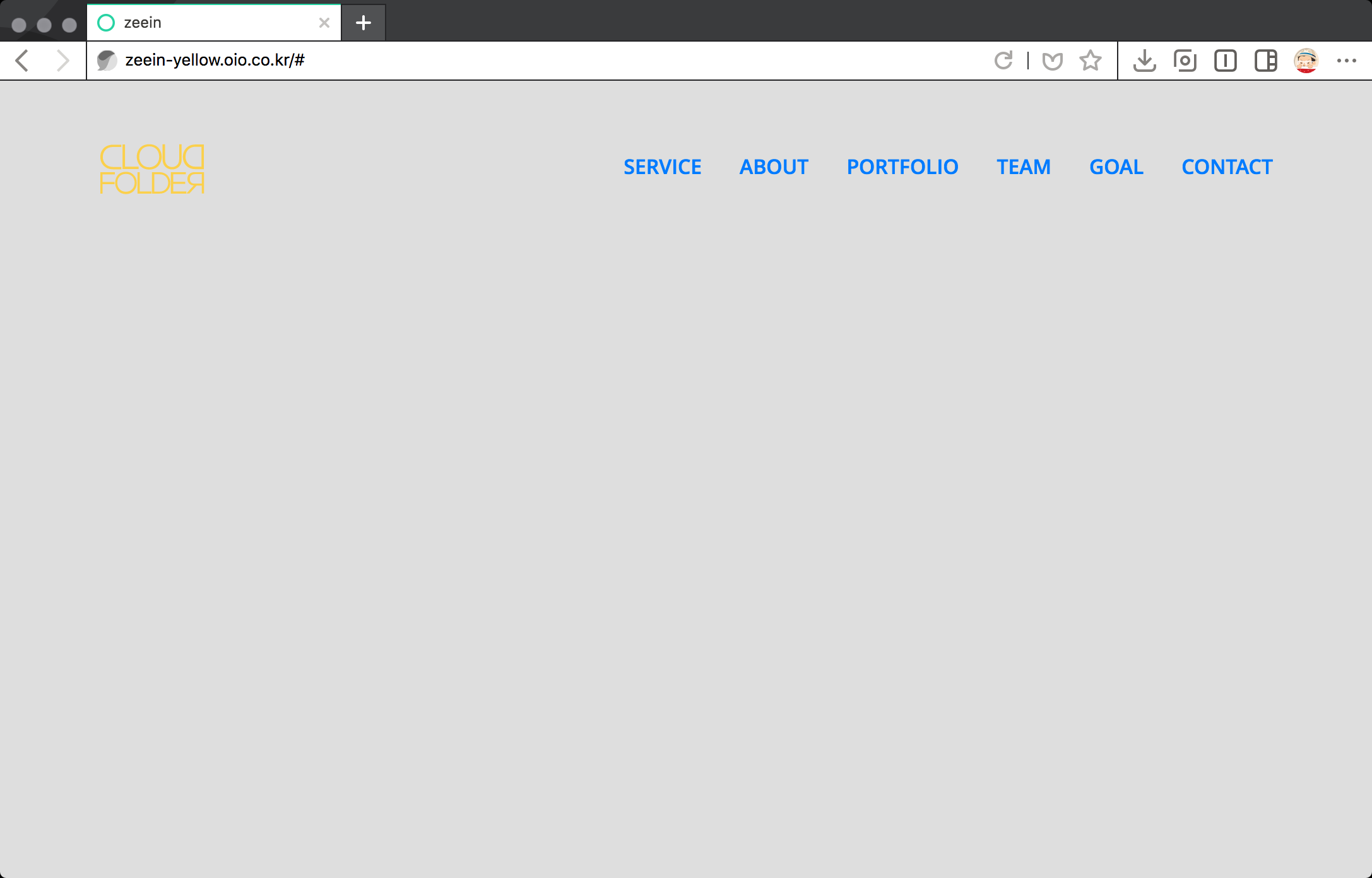
여기까지 모든 작업이 완료되면 아래와 같은 페이지가 나와야 합니다.
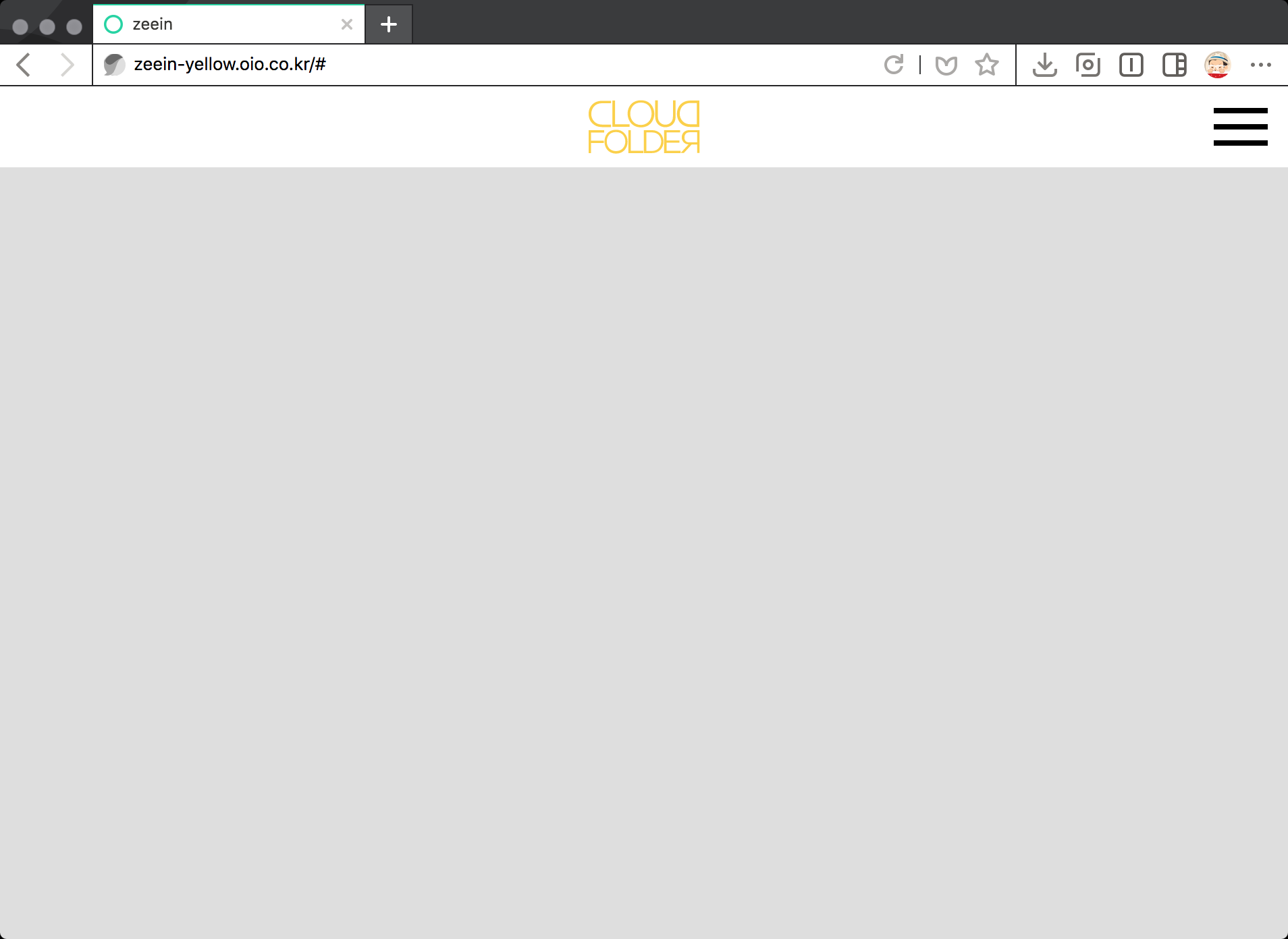
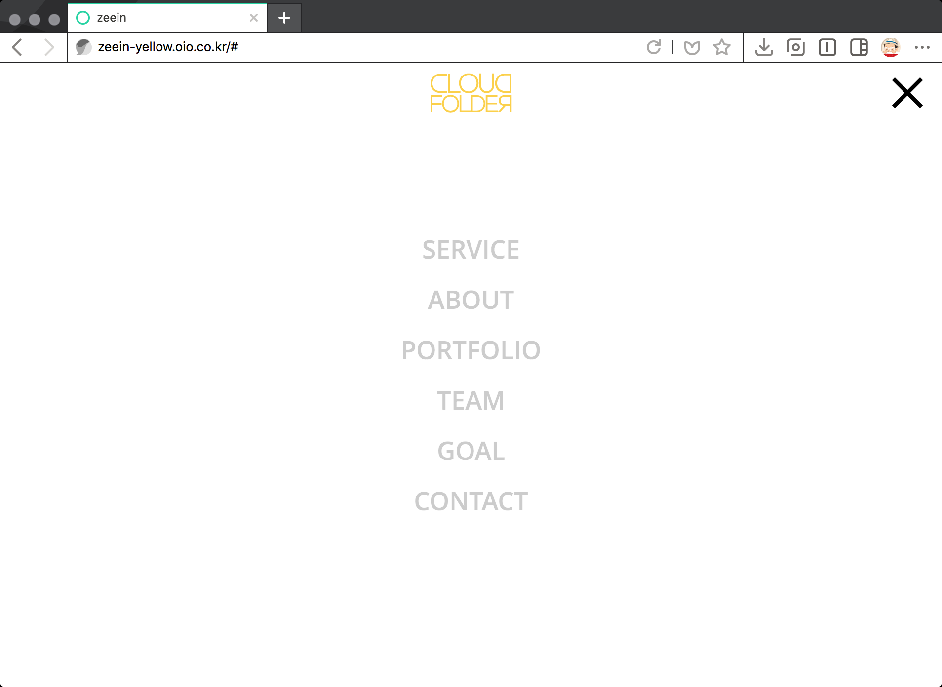
화면 사이즈에따라 메뉴가 변경 되는 지 다시 한번 확인합니다.
메뉴에 조금 더 효과를 줄 예정인데 이후 작업은 제일 마지막에 전반적인 정리를 하면서 다시한번 다루겠습니다.
functions.php파일은 테마파일을 만들어서 사용중인데요.
header파이이나 js파일을 업로드할때 테마파일에 새로운 폴더를 만들어서 업로드해야하나요 아니면 기존테마파일에 올려야하나요?
감사합니다.
기본적으로 header파일의 경우 테마폴더에 넣어야 하고
js파일은 특정 폴더를 생서해서 넣어야 관리하실 때 편리하게 관리하실 수 있습니다.